Accessible colours
A practical approach for generating a visually consistent and accessible colour spectrum.
pearl
periwinkle
amber
emerald
deep-red
100
Aa
Aa
Aa
Aa
Aa
Aa
Aa
Aa
Aa
Aa
200
Aa
Aa
Aa
Aa
Aa
Aa
Aa
Aa
Aa
Aa
300
Aa
Aa
Aa
Aa
Aa
Aa
Aa
Aa
Aa
Aa
400
Aa
Aa
Aa
Aa
Aa
Aa
Aa
Aa
Aa
Aa
500
Aa
Aa
Aa
Aa
Aa
Aa
Aa
Aa
Aa
Aa
600
Aa
Aa
Aa
Aa
Aa
Aa
Aa
Aa
Aa
Aa
700
Aa
Aa
Aa
Aa
Aa
Aa
Aa
Aa
Aa
Aa
800
Aa
Aa
Aa
Aa
Aa
Aa
Aa
Aa
Aa
Aa
900
Aa
Aa
Aa
Aa
Aa
Aa
Aa
Aa
Aa
Aa
1000
Aa
Aa
Aa
Aa
Aa
Aa
Aa
Aa
Aa
Aa
1100
Aa
Aa
Aa
Aa
Aa
Aa
Aa
Aa
Aa
Aa
1200
Aa
Aa
Aa
Aa
Aa
Aa
Aa
Aa
Aa
Aa
1300
Aa
Aa
Aa
Aa
Aa
Aa
Aa
Aa
Aa
Aa
The problem with popular colour palettes
Visually inconsistent and difficult to manage accessibility
Let's say you're a fan of TailwindCSS's colour palette, you've just creates a button UI element with your brands primary colour tailwinds blue-700 #1d4ed8, and white text, I bet it looks great and is perfectly accessible. Now let's say You want to also create a secondary button with an orange background and white text so you reach for tailwinds orange-700 #c2410c. You might be surprised to find that despite both colours being the same shade, the contrast between the text and the background is not as good as it was with the blue button, only 3.55 which is considerably lower than it was with the blue button which had a contrast of 5.16. In fact, the contrast is so much worse that it's now technically not accessible with a contrast below the minimum accessibility standard contrast of 4.5 for normal sized text.
This problem is even worse when comparing shades of the greyscale colours to the more vibrant ones. One particularly egregious example is neutral-600 #525252 and yellow-600 #ca8a04 which have contrasts of 7.81 and 2.93 (?!) against white respectively. Clearly the concept of "shade" means nothing.
Not made with dark themed UI's in mind
I invite you to attempt create a dark themed UI using only the colours provided by tailwind. You'll find that trying to include any colour other than the greyscale colours is a real struggle. The vibrant colours are simply too bright to be used in a dark themed UI.
It doesn't have to be this way.
I would like to hereby propose a new way of generating a colour palette that is visually stunning, perceptually uniform, accessible, and works beautifully in both light and dark themed UI's. But before we can begin discussing the approach, I need you to forget everything you know about colour.
Re-framing the concept of colour
In order to understand why this works, you need to completely shift your perspective on the concept of what a colour is. When most developers or designers think of colour, they think of RGB, hex, and HSL. These are the colour formats that we use in CSS. They are also the formats that are used by most design tools. But here's the thing...
RGB, hex, and HSL do not actually represent colours.
This is the first revelation to wrap your head around. RGB (and by extension hex and HSL) is a representation of the state of a piece of hardware. It is an instruction to be given to a pixel that tells it how much of red, green, and blue light it should emit. It is not tied to a real-world concept of a colour. RGB as a format is constrained to represent colours only within the sRGB colour space, which is a standardised representation of the capabilities of hardware.
The CIELAB colour space
Unlike the sRGB colour space, The CIELAB colour space does not the represent hardware capabilities or even the physical properties of light. Instead it represents human perception of colour.
Introducing LCH
LCH is the ultimate way to express a colour.
It is simply a way to navigate the CIELAB colour space using polar co-ordinates. It has 3 axes:
L - Lightness
This does NOT represent luminosity. Remember the CIELAB colour space has no relation to the physical properties of light. It represents how "light" a colour is appears. This is expressed as a percentage from 0% to 100%, with 0% being black and 100% being white.
C - Chroma
This represents how strongly a hue is expressed, it can also be thought of as saturation. This property starts at 0 and is unbounded.
H - Hue
Hue represents the angle in degrees around the colour wheel from 0° to 360°.
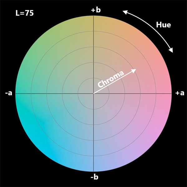
All colours perceptable to humans can be fully described by these 3 properties.
Perceptual uniformity
The CIELAB colour space is designed to be perceptually uniform.
By setting lightness to 70%, youre saying: "I want a colour that humans will perceive as being 70% light". The colour will always be percieved as such regardless of the hue or chroma. The same is true for the other properties.
A result of this is that each variable is completely independent of the others. This makes LCH extremely easy and intuitive to work with because we can tweak each variable in isolation and make very deliberate adjustments to colours in an intuitive way.
OKLCH - an implementation of LCH in CSS
OKLCH is an actual implementation of the LCH specification. It has not achieved widespread browser support yet, but it can still be safely used right now with a postcss plugin.
background-color: oklch(50% 0.1 15deg);
You can play around with the OKLCH colour picker.
Generating a colour palette
Now that we understand LCH, we're ready to learn how to use LCH to generate a colour palette.
The process is as follows:
- Choose a scale of lightness values for grey only
- Introduce more hues such as brand and status colours
- Tuning chroma values
Choosing our lightness levels
The key factor informing our choices for lightness is contrast. Colours are a relative phenomenon, throughout this process it is vitally important that you test your colours against a variety of backgrounds, light and dark.
Yes, there is such a thing as too much contrast! Jarring 21.0 contrast white on black text is a common problem (looking at you, brutalism UI's). The most comfortable contrast for reading body text is actually between 8 and 10 for a light themed UI with dark text, and between 10 and 16 for a dark themed UI with light text. You can and should test this out for yourself.
It's important to get your lightness levels right for grey above all other colors. Grey is the most important and most common color in a UI. The creators of TailwindCSS Adam Wathan and Steve Schoger talk about the importance of designing UI's in greyscale first in their book: Refactoring UI.
98.5%: highest lightness that is clearly distinguishable from white13.5%: lowest lightness that is clearly distinguishable from black
There's really no need to have colors outside of these lightness levels because they would be too close to white or black to be meaningful. So they should mark the lightest and darkest shades in our spectrum.
These are quite harsh colors though, so you may not want to use them for large areas of your UI. Let's try to find more comfortable lightness levels for our backgrounds and surfaces so that we don't over-expose our retinas and so that our text, icons, and other elements can have a comfortable contrast against them.
96.5%: a comfortable lightness for a light background17.5%: a comfortable lightness for a dark background
These colors also leave plenty of room either side to add layered surfaces which add depth and create an effect of raised or sunken elements against the background.
Now lets find lightness levels that have a comfortable contrast against these backgrounds that we can use for body text, icons, and other elements.
86.0%: ~12 contrast against our dark background38.0%: ~9 contrast against our light background
Other lightness levels that we need to consider are the lightness levels that result in a contrast of at least 4.5 against black and white (with some buffer so that when we eventually expand our color spectrum to include other hues, we can be sure that they will still have the minimum contrast for accessibility of 4.5).
62.0%: lowest lightness that results in contrast of at least 4.5 against black for any given hue51.0%: highest lightness that results in contrast of at least 4.5 against white for any given hue
Any lightness levels above 62.0% are always accessible against black, and any lightness levels below 51.0% are always accessible against white. These colors will be very useful because they are also colors that typically support the highest chroma values for the majority of hues, giving us vibrant colors that we can use for primary action buttons or similar. These two shades are also near the point of maximum chroma, meaning we are able to create the most vibrant colors using these two shades. This makes them nice choices for attention grabbing buttons.
These lightness levels form the foundation of our color spectrum. Lets arrange them into a spectrum, assign each one a 'shade' number, and add a few filler shades wherever there are large gaps.
100 98.5%: lightest color200 96.5%: light background300 93.0%: gap filler400 86.0%: light body text500 73.0%: weaker contrast for de-emphasized light text600 62.0%: all colors above are accessible against black700 51.0%: all colors below are accessible against white800 44.0%: weaker contrast for de-emphasized dark text900 38.0%: dark body text1000 28.0%: gap filler1100 22.0%: gap filler1200 17.5%: dark background1300 13.5%: darkest color
Introducing colour
W.I.P
Tuning chroma values
W.I.P
Most devices are still limited to sRGB
By using oklch in our css, we're specifying what colour we want, and allowing physical devices to attempt to reproduce that colour as faithfully as possible withing the constraints of their hardware. So what actually happens when a device that only supports sRGB is given an OKLCH colour?
Fallback colours
Oklch implements an approach to calculating an sRGB fallback for colours that transcend sRGB. The chroma is reduced until the colour is within the sRGB colour space. Therefore OKLCH is fully backwards compatible. This means that in the worst case scenario the colour will be desaturated but it will still have the same hue and lightness meaning that there is no risk of accessibility issues.
Leveraging OKLCH without actually using it
This is the best part. We can generate our colour palette using the OKLCH colour picker, and while doing so we ensure that our colours also fall within the sRGB colour space. We can then use the generated hex or RGB values in our css.
This has all the benefits of using OKLCH directly, the only downside being that we sacrifice vibrant colours on devices that might support extended colour spaces.